Saturday, 28 June 2014
Wednesday, 4 June 2014
Principles of Design
Principles of Design
Balance

the arrangement of lines, color, values, textures, forms and space. There are 3 types of balance: formal or symmetrical or informal or asymmetrical and radial balance. Formal balance has an equal weight on both sides. Informal has a different weight on each side to maintain balance, Radial balance is a circular balance moving out from a central object to maintain balance.
Emphasis

is the way of bringing a dominance and subordination into a design or painting. Major objects, shapes or colors may dominate a picture by taking up more space or by being in volume on by being darker in color than the subordinating objects, shapes, and colors. There must be balance between the dominant and subordinating elements.
Movement

the use of lines, color, values, textures, forms and shapes to carry or direct the eye of the viewer from one part of the design or picture to other called movement. Movement is created in art by the artist uses the elements of design. It is generally created by the arrangement of shapes.
Variety and contrast


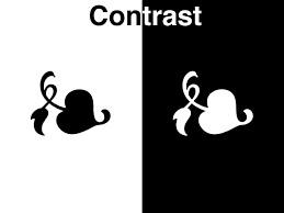
an artist uses elements of art to create diversity and differences in design. Contrasting colors, textures, and patterns all add interest to the artwork. Highlights of color to the corners of some shapes may be used to add contrast.
Proportion
the size of one part of artwork to its other parts is called proportion. Artists use proportion to show emphasis, distance and use if space and balance
Unity

is the result of how all elements and principles work together. All parts must some relation to each other. They must fit together to create the overall message and effect.
Repetition
Repetition
fr. Journey towards MAPEH 7 k12, pp 97- 98
Elements of Art
Elements of Art
Propelling:
What is a point?
point (point)
noun
1. A sharp or tapered end: the point of a knife; the point of the antenna.
2. An object having a sharp or tapered end: a stone projectile point.
3. A tapering extension of land projecting into water; a peninsula, cape, or promontory.
4. A mark formed by or as if by a sharp end.
5. A mark or dot used in printing or writing for punctuation, especially a period.
6. A decimal point.
7. Linguistics A vowel point.
8. One of the protruding marks used in certain methods of writing and printing for the blind.
Guide Questions:
1. What is art?
2. What are the elements of art?
3. How can we make a unique art using this elements?
Materials for the Activity
Sketch pad
Pencils
Coloring materials ( crayons, watercolor, oil pastel, etc. )
Activity:
Art Activity 1:Draw the kinds of line in your sketch pad.
Art Activity 2: Draw shapes in your sketch pad and color it.
Art Activity 3: Make a color wheel of primary, secondary and tertiary and label each color.
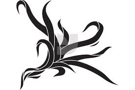
Lines art the first element of art. A line can be used to express various things or feelings; it can be used to show various moods or anything abstract. Lines can be in various ways to create different compositions. A horizontal or vertical line can be used to express various things in different ways, such as, only vertical line can be used to express an orderly feeling, whereas, horizontal lines can give an orderly meaning, whereas, horizontal lines can give a feeling of peace and stillness. Diagonal lines are used to create feelings of movement. Although, it is up to the artist how he expresses his concept through the use of lines.



Curvilinear


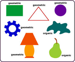
Organic Line: a
mark with length and direction that forms an irregular shape, or one that might
be found in nature, rather than a regular, mechanical shape
Organic shapes are associated with
things from the natural world, like plants and animals.
Inorganic line: a mark with length and direction that is straight and forms a geometric shape
So basically it means anything that is manmade like a house is inorganic, and anything in nature or not manmade like a leaf or animal, is inorganic.
Inorganic line: a mark with length and direction that is straight and forms a geometric shape
So basically it means anything that is manmade like a house is inorganic, and anything in nature or not manmade like a leaf or animal, is inorganic.
Curvilinear
1. consisting of or bounded by curved lines: a curvilinear figure.
3. formed or characterized by curved lines.
Geometric - Wherever the ends of a continuous
line meet, a shape is formed. Geometric shapes such as circles, triangles or
squares have perfect, uniform measurements and don't often appear in nature
Line.

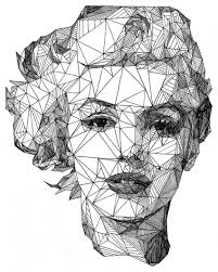
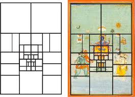
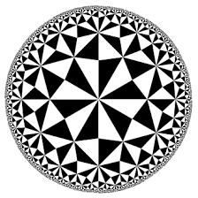


Shape when the lines form together, it will form shapes. A shape always has 2 dimensions, length and as well as width. This is represented as an enclosed area that is sometimes defined by color, value, space, texture and form. Shapes can be geometric, rectangles, ovals and squares.

Form A form always has 3 dimensions: length, width and height. Examples are cubes, pyramids, spheres, or even cylinder. Thus, form has depth as well as height. Sculptures decorative arts serve as good examples of form.

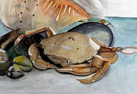

Value the value refers to the changes in the base color. This is also determined by how much light is reflected or absorbed by any surface. Values involve the various intensities of the tones or color. This could be the highlights, midtones, or even shadows in any painting or sculpture.

Texture is the quality of a surface or the way any work of art is represented. There are three kinds of basic textures, actual, simulated, and the invented texture. Lines and shading can be used to create different textures as well. For example, if one is portraying certain fabrics, one needs to give the feeling of the right texture so that is closely resembles what the artist is trying to convey.

Color always has 3 characteristics, which are hue, value and intensity. Hue means the shades. Value means to the lightness or darkness. Intensity refers to the brightness or dullness of the work of art.


Space is the creation of visual perspective; this gives the illusion of depth. Space can also mean the way an artist uses the area within the picture plane. Real space actually 3 dimensional. The way any artist uses the combination of the positive and negative space can have a great effect on his entire composition. The right use of space can go a long way in creating a bigger impact with even the minimum use of lines. 3 dimensional space can be created with the help of shading and perspective to give a feeling of depth.

Sources:
Sources:
fr. Journey towards MAPEH 7, Maria Fe M. Limjoco, Darci Roye M. Lapus, Jovit L. Jeniebre, Gilbert G. Cerozo, pp 96 - 97
http://awesomeartists.com/ART/mTableOfContentsTheABCsOfArt.htm
http://www.thefreedictionary.com/point
http://awesomeartists.com/ART/mTableOfContentsTheABCsOfArt.htm
http://www.thefreedictionary.com/point


